背景
图一:不同的癌症用不同的颜色展示
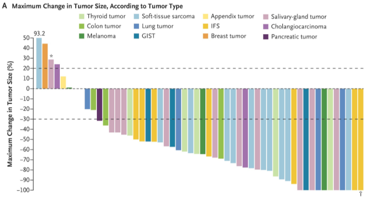
出自文章PMID: 29466156
图二:做类似的图用于GO、KEGG富集分析结果展示,不显著的显示灰色,左右分开的名称,正负富集分开,左右分开画在一张图上。
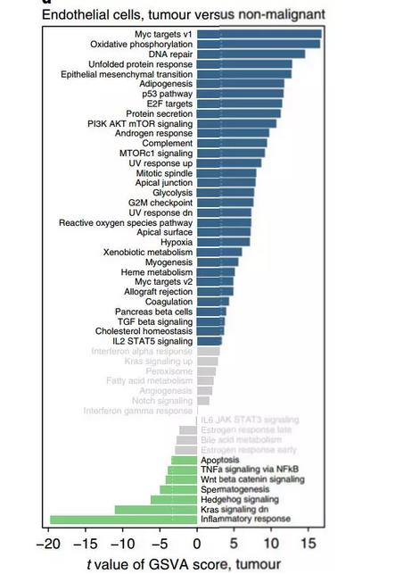
出自文章PMID: 29988129
原文的输入数据是GSVA score,本代码只模仿形式,不包括GSVA分析。
应用场景
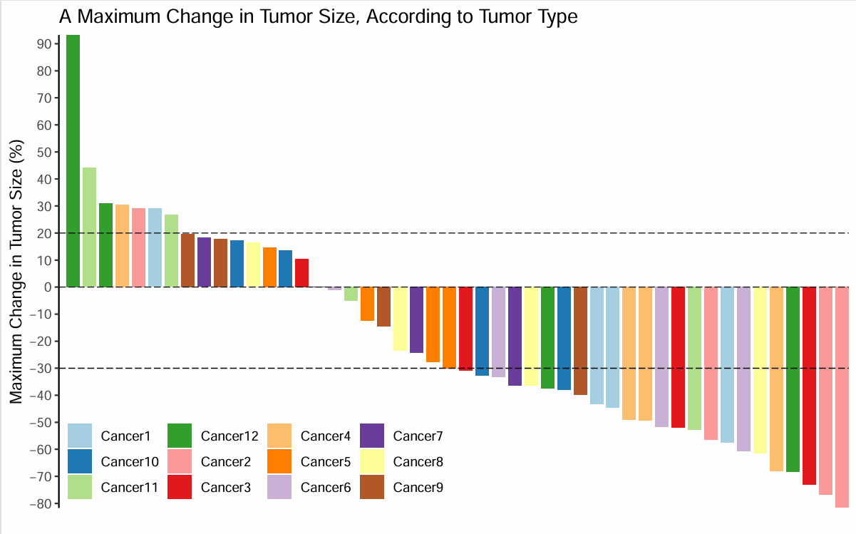
场景一:各肿瘤某一指标的比较,例如图一的肿瘤缓解率。
场景二:GSVA结果展示,类似于图二。
场景一
每个ID显示为一种颜色
输入数据
df<-read.csv("easy_input1.csv")
head(df)

#按照score排序
df<-df[order(df$score,decreasing = T),]
df$index<-seq(1,nrow(df))
head(df)
开始画图
library(ggplot2)
p<-ggplot(df,aes(x=index,y=score,fill=ID)) +
  geom_bar(stat = 'identity',width = 0.8) +
  scale_fill_brewer(type = "Qualitative", palette = "Paired") + #bar的颜色

  scale_y_continuous(breaks=seq(-100, 100, 10), #y轴刻度
                     expand = c(0,0)) + #上下都不留空
  scale_x_discrete(expand = expand_scale(mult = c(0.01,0))) + #左边留空,右边到头

  #画3条横线
  geom_hline(yintercept = c(-30,0,20),
             linetype = 5, #画虚线
             size = 0.3) + #线的粗细

  #其他主题
  labs(x = "", y = "Maximum Change in Tumor Size (%)",
       title = "A Maximum Change in Tumor Size, According to Tumor Type") +
  theme_bw() + #去除背景色
  theme(panel.grid =element_blank()) + #去除网格线
  theme(panel.border = element_blank()) + #去除外层边框
  theme(axis.line = element_line(colour = "black")) + #沿坐标轴显示直线
  theme(axis.line.x = element_blank(), axis.ticks.x = element_blank(), axis.text.x = element_blank()) + #去除x轴

  #图例
  guides(fill = guide_legend(ncol = 5,title = NULL)) + #图例分5列
  scale_size(range=c(5,20)) +
  theme(legend.background = element_blank(), #移除整体边框
        #图例的左下角置于绘图区域的左下角
        legend.position=c(0,0),legend.justification = c(0,0))
        #改用下面这行,图例就会位于顶部
        #legend.position="top")
p
#保存到PDF文件
ggsave("CancerBar.pdf",width = 8,height = 5)
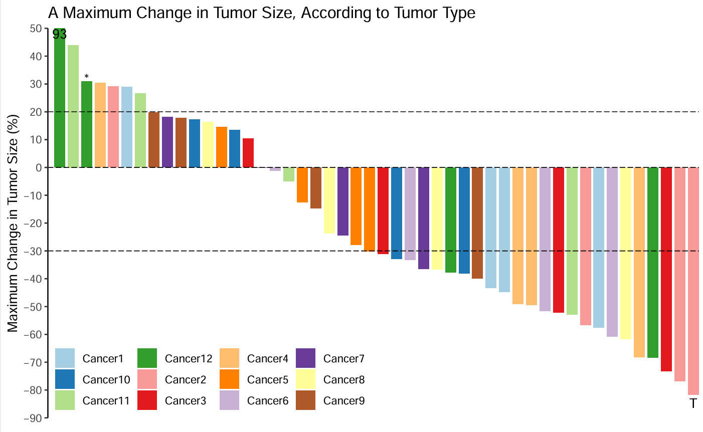
极大值的处理
有一个值远高于其他值,右侧会很空。
因此,原图作者让y轴适合大部分数据,然后在最高的那个bar上标出实际数据
#设置坐标轴范围,最大值设为50,以适应大多数数据
p<-p + coord_cartesian(ylim = c(-90,50)) + #y轴范围,根据实际情况调整
  #添加数据标签
  geom_text(data = subset(df, score > 50),
            aes(index, 48,label=round(score))) + #在超过50的bar上标出实际数据
  geom_text(data = subset(df, index == 3),
            aes(index, score + 1,label = "*")) + #作者的特殊标记
  geom_text(data = subset(df, index == nrow(df)),
            aes(index, score - 3, label = "T"))  #作者的特殊标记
p

#保存到PDF文件
ggsave("CancerBar_label.pdf",width = 8,height = 5)
场景二·原文
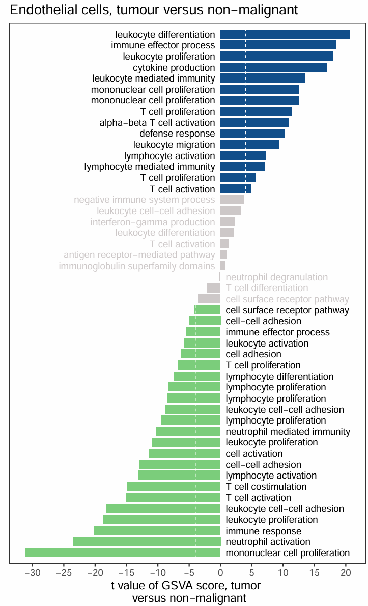
score绝对值小于阈值的bar显示为灰色
输入数据
包含两列:ID和score
df<-read.csv("easy_input2.csv")
head(df)

#按照score的值分组
df$group<-cut(df$score, breaks = c(-Inf,-4,4,Inf),labels = c(1,2,3))
head(df)

#按照score排序
df<-df[order(df$score,decreasing = F),]
df$index<-seq(1,nrow(df))
head(df)
开始画图
library(ggplot2)
ggplot(df,aes(x=index,y=score,fill=group)) +
  geom_bar(stat = 'identity',width = 0.8) +
  scale_fill_manual(values = c("palegreen3","snow3","dodgerblue4")) + #bar的颜色
  scale_x_discrete(expand = expand_scale(add = .6)) +
  scale_y_continuous(breaks=seq(-30, 20, 5)) +
  coord_flip() + #坐标轴互换

  #画2条横线
  geom_hline(yintercept = c(-4,4),
             color="white",
             linetype = 2,#画虚线
             size = 0.3) + #线的粗细

  #写label
  geom_text(data = subset(df, score > 0),
            aes(x=index, y=0, label=paste0(ID,"  "), color = group),#bar跟坐标轴间留出间隙
            size = 3, #字的大小
            hjust = "inward" ) +  #字的对齐方式
  geom_text(data = subset(df, score < 0),
            aes(x=index, y=0, label=paste0("  ",ID), color = group),
            size = 3, hjust = "outward") +
  # 注意标签的黑色灰色颜色顺序
  scale_colour_manual(values = c("snow3","black","black")) +
  # scale_colour_manual(values = c("black","snow3","black")) +

  #其他主题
  labs(x = "", y = "t value of GSVA score, tumor \n versus non-malignant",
       title = "Endothelial cells, tumour versus non-malignant") +
  theme_bw() + #去除背景色
  theme(panel.grid =element_blank()) + #去除网格线
  theme(panel.border = element_rect(size = 0.6)) + #边框粗细
  theme(axis.line.y = element_blank(), axis.ticks.y = element_blank(), axis.text.y = element_blank()) + #去除y轴

  guides(fill=FALSE,color=FALSE) #不显示图例

#保存到PDF文件
ggsave("GObar.pdf",width = 5,height = 8)
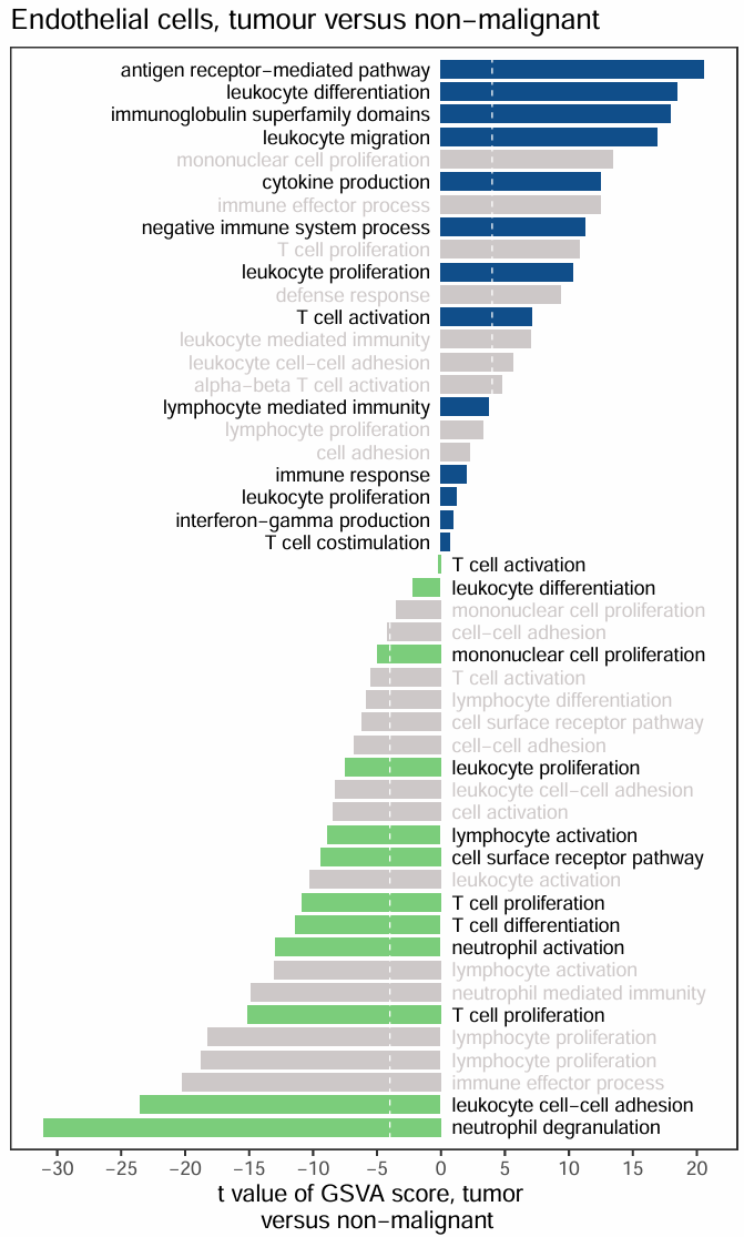
场景二·不显著的显示为灰色
pvalue>0.05的bar显示为灰色
输入数据
包含三列,ID、score和pvalue
df<-read.csv("easy_input3.csv")
head(df)

#按照pvalue分组
df$p.group<-cut(df$pval, breaks = c(-Inf,0.05,Inf),labels = c(1,0))
#按照score分组
df$s.group<-cut(df$score, breaks = c(-Inf,0,Inf),labels = c(0,1))
#合并
df$ps.group <- paste0(df$p.group,df$s.group)

#根据pvalue和score分为3组
df$group <- ifelse(df$ps.group=='10','1',ifelse(df$ps.group=='11','2','3'))
head(df)

#按照score排序
df<-df[order(df$score,decreasing = F),]
df$index<-seq(1,nrow(df))
head(df)
开始画图
只调整了颜色顺序,其余跟“场景二·原文”的画图代码是一样的
library(ggplot2)
ggplot(df,aes(x=index,y=score,fill=group)) +
  geom_bar(stat = 'identity',width = 0.8) +
  scale_fill_manual(values = c("palegreen3","dodgerblue4","snow3")) + #颜色
  scale_x_discrete(expand = expand_scale(add = .6)) +
  scale_y_continuous(breaks=seq(-30, 20, 5)) +
  coord_flip() +

  geom_hline(yintercept = c(-4,4),
             color="white",
             linetype = 2,
             size = 0.3) +

  geom_text(data = subset(df, score > 0),
            aes(x=index, y=0, label=paste0(ID,"  "), color = p.group),
            size=3,
            hjust = "inward") +
  geom_text(data = subset(df, score < 0),
            aes(x=index, y=0, label=paste0("  ",ID), color = p.group),
            size=3,hjust = "outward") +
  scale_colour_manual(values = c("black","snow3")) +

  labs(x = "", y = "t value of GSVA score, tumor \n versus non-malignant",
       title = "Endothelial cells, tumour versus non-malignant") +
  theme_bw() +
  theme(panel.grid =element_blank()) +
  theme(panel.border = element_rect(size = 0.6)) +
  theme(axis.line.y = element_blank(), axis.ticks.y = element_blank(), axis.text.y = element_blank()) +
  guides(fill=FALSE,color=FALSE)

#保存到PDF文件
ggsave("GObar_pval.pdf",width = 5,height = 8)
 |Archiver|手机版|小黑屋|bioinfoer
( 萌ICP备20244422号 )
|Archiver|手机版|小黑屋|bioinfoer
( 萌ICP备20244422号 )

 发表于 2025-5-31 16:38:30