背景
线性回归,画出双坐标轴的图
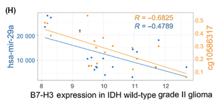
出自文章PMID: 30027617
应用场景
同时计算和展示3组数据的相关性,A vs. B 和 A vs. C。
例如例文中同时展示B7-H3表达跟mir-29a的相关性,以及跟甲基化的相关性。由此看出:In IDH‐wild grade II gliomas, B7‐H3 expression seemed to be downregulated by both methylation on cg10586317 and microRNA‐29a, rationalizing the paradox in grade II gliomas with wild‐type IDH.
环境设置
使用国内镜像安装包
options("repos"= c(CRAN="https://mirrors.tuna.tsinghua.edu.cn/CRAN/"))
options(BioC_mirror="http://mirrors.ustc.edu.cn/bioc/")
install.packages("ggplot2")
加载包
library(ggplot2)
library(gtable) #方法二要用到
library(grid) #方法二要用到

Sys.setenv(LANGUAGE = "en") #显示英文报错信息
options(stringsAsFactors = FALSE) #禁止chr转成factor
参数设置
## 两个坐标轴的颜色
s1Colour="#6B9EC2"
s2Colour="#EE861A"

## xlab
xtitle="mRNA expression"
## ylab
ylefttitle="miRNA"
yrighttitle="cg10586317"

##Aspect ration of picture,图的宽高比例
AspectRatio = 5/2
输入文件
包含三列:对应X轴和两个Y轴
分别对应例文中的X轴:mRNA表达量,可以是FPKM等值。
左侧Y轴:miRNA的表达量
右侧Y轴:DNA甲基化水平
inputData <- read.table("easy_input.txt", header = T)
head(inputData)
#inputData$Y2 <- inputData$Y1 * 0.00001
#All secondary axes must be based on a one-to-one transformation of the primary axes.
#默认右侧Y轴跟左侧Y轴范围是一样的,然而示例数据的Y1和Y2范围差距很大,因此需要用Y1和Y2的数值计算两个Y轴的比例
(scaleFactor <- max(inputData$Y1) / max(inputData$Y2))
#在画右侧Y轴、X和Y2的散点和拟合线时都要用这个比例来换算
#除了用乘法,你还可以用加法

#前面参数设置了图的宽高比例,保存在AspectRatio里
#用Y1和Y2的数值换算坐标轴的宽高比,在后面的画图代码coord_fixed中要用到
(ratioValues <- ((max(inputData$X)-min(inputData$X))/(max(inputData$Y1)-min(inputData$Y1))) / AspectRatio)
计算相关系数
#写一个计算相关系数的函数,同时写成图中的格式
correlation <- function(data,X,Y){
  #计算相关系数
  R <- cor(X,Y,method = "pearson") #或"pearson", "kendall"

  #把相关系数写成图中展示的格式
  eq <- substitute(~~italic(R)~"="~r, list(r = format(round(R, 4),nsmall= 4)))
  Req <- as.character(as.expression(eq))
  return(Req)
}

#用上面的函数分别计算mRNA跟miRNA、DNA甲基化之间的相关系数
(R1cor <- correlation(inputData,inputData$X,inputData$Y1))
(R2cor <- correlation(inputData,inputData$X,inputData$Y2))
开始画图
此处提供两种方法画图:
- 方法一,优点:简单,易于理解;缺点:右侧Y轴的label的文字方向与原文相反。
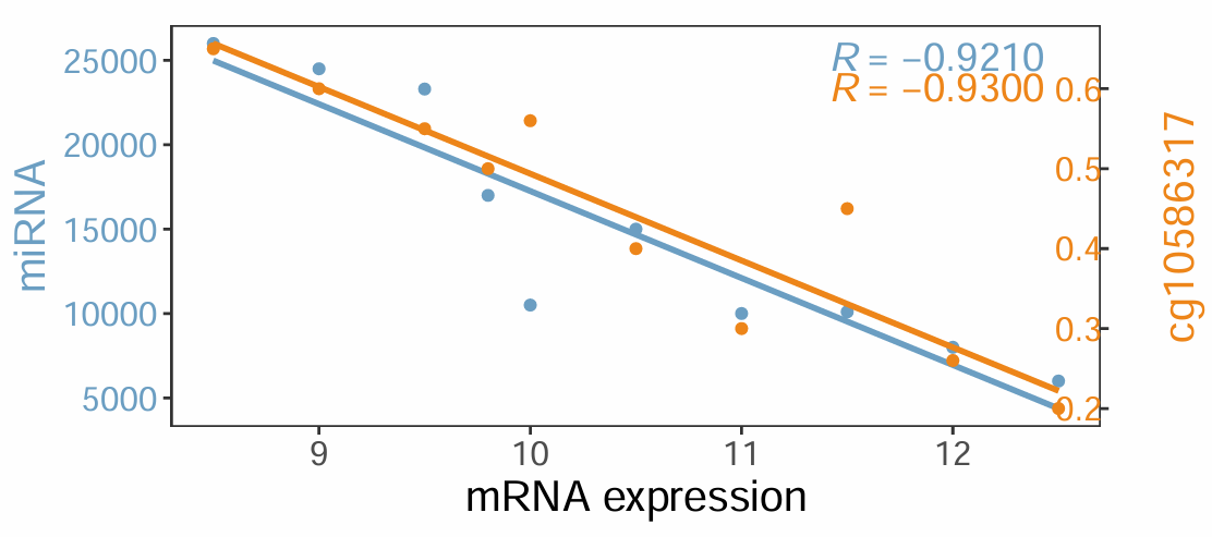
- 方法二,优点:完全复现原文的图;缺点:用到gtable、grid,小伙伴可能不熟悉。
方法一
p <- ggplot(inputData, aes(x=inputData$X )) +
  geom_point(aes(y=inputData$Y1), col=s1Colour) + #画X和Y1的散点
  geom_smooth(aes(x=inputData$X, y=inputData$Y1),
              method="lm", se=F, col=s1Colour) + #添加线性拟合线

  geom_point(aes(y=(inputData$Y2) * scaleFactor), col=s2Colour) + #画X和Y2的散点
  geom_smooth(aes(x=inputData$X, y=inputData$Y2 * scaleFactor),
              method="lm", se=F, colour=s2Colour) + #添加线性拟合线

  scale_y_continuous(name = ylefttitle,
                     #breaks = c(5000, 10000, 15000, 20000, 25000), #左侧Y轴刻度
                     sec.axis=sec_axis(trans = ~./scaleFactor, name = yrighttitle)) + #画右侧Y轴
  coord_fixed(ratio = ratioValues) + #坐标轴的宽高比

  labs(x=xtitle) + theme_bw() + #去除背景色
  theme(panel.grid = element_blank(), #去除网格线
        axis.title.x = element_text(size=15), #X轴题目字号
        axis.text.x = element_text(size=12), #X轴刻度字号
        axis.title.y.right = element_text(size=15, color = s2Colour), #右侧Y轴刻度字体的颜色
        axis.text.y.right = element_text(size=12, color = s2Colour), #右侧Y轴title颜色
        axis.title.y.left = element_text(size=15, colour = s1Colour), #左侧Y轴刻度字体的颜色
        axis.text.y.left = element_text(size=12, color = s1Colour)) #左侧Y轴title颜色
p
把前面计算出的相关系数R1cor和R2cor标在图上
# 相关系数在图上的位置,需根据你自己的数据灵活调整
x <- max(inputData$X)*(0.95)
y <- max(inputData$Y1)*(0.97)
y2 <- max(inputData$Y1)*(0.9)

# 标相关系数
p1 <- p + annotate("text", x=x, y=y, label=R1cor, size=5, parse = TRUE, col=s1Colour ) +
  annotate("text", x=x, y=y2, label=R2cor, size=5, parse = TRUE, col=s2Colour )
p1

# 保存到文件
ggsave("TwoPlotOfLinearRegression.pdf", width = 6, height = 3)
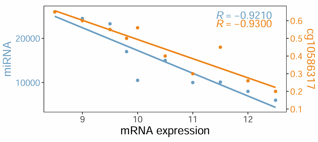
右侧y轴的title头朝右,原文头朝左。我们用方法二来实现对原文完全复现。
方法二
先用ggplot2拿到两套坐标的plot object,修改之后重新画图。
用ggplot拿到两套坐标的plot object
#X和Y1的散点、拟合线、相关系数文字
p1 <- ggplot(inputData, aes(x=inputData$X, y=inputData$Y1)) +
  geom_point(col=s1Colour) +
  geom_smooth(aes(x=inputData$X, y=inputData$Y1), method="lm", se=F, col=s1Colour)+
  annotate("text", x=x, y=y , label=R1cor,size=5, parse = TRUE, col=s1Colour ) +
  annotate("text", x=x, y=y2, label=R2cor,size=5, parse = TRUE, col=s2Colour )+

  labs(x=xtitle, y=ylefttitle) + theme_bw()+
  theme(panel.grid = element_blank(), #去除网格线
        axis.title.x = element_text(size=15),
        axis.text.x = element_text(size=12),
        axis.title.y = element_text(size=15, colour = s1Colour),
        axis.text.y = element_text(size=12, color = s1Colour))+
  coord_fixed(ratio = ratioValues)

#X和Y2的散点、拟合线、背景透明
p2 <- ggplot(inputData, aes(x=inputData$X, y=inputData$Y2)) +
  geom_point(col=s2Colour) +
  geom_smooth(aes(x=inputData$X, y=inputData$Y2), method="lm", se=F, colour=s2Colour)+

  labs(y=yrighttitle) + theme_bw() +
  theme(panel.background = element_rect(fill = NA),
        panel.grid = element_blank(), #去除网格线
        axis.title.y = element_text(size=15, color = s2Colour),
        axis.text.y = element_text(size=12, color = s2Colour)) +
  coord_fixed(ratio = ratioValues)

#提取plot object,保存到gtable数据结构里
g1 <- ggplot_gtable(ggplot_build(p1))
g2 <- ggplot_gtable(ggplot_build(p2))

#查看一下提取出的信息长啥样
head(g1$layout)
head(g2$layout)
重新画图
**提示:**选择从grid.newpage()到任意一个grid.draw(g)之间的部分一起运行,就会看到这部分代码的画图效果。
#pdf("TwoPlotOfLinearRegression_plus.pdf", width = 6, height = 3)
grid.newpage()

#画X和Y1的散点、拟合线、相关系数文字
pp <- c(subset(g1$layout, name == "panel", se = t:r))
g <- gtable_add_grob(g1, g2$grobs[[which(g2$layout$name == "panel")]], pp$t,
                     pp$l, pp$b, pp$l)
#head(g)
grid.draw(g)

#画X和Y2的散点、拟合线
ia <- which(g2$layout$name == "axis-l")
ga <- g2$grobs[[ia]]
ax <- ga$children[[2]]

ax$widths <- rev(ax$widths)
ax$grobs <- rev(ax$grobs)

g <- gtable_add_cols(g, g2$widths[g2$layout[ia, ]$l], length(g$widths) - 1)

grid.draw(g)

#画右侧Y轴刻度标签
g <- gtable_add_grob(g, ax, pp$t, length(g$widths) - 1, pp$b)
grid.draw(g)

#画右侧Y轴title
yLabTitle <- which(g2$layout$name == "ylab-l")
gaYLT <- g2$grobs[[yLabTitle]]
axYLT <- gaYLT$children[[1]]

axYLT$widths <- rev(axYLT$widths)
axYLT$grobs <- rev(axYLT$grobs)

g <- gtable_add_cols(g, g2$widths[g2$layout[yLabTitle, ]$l], length(g$widths) - 1)
g <- gtable_add_grob(g, axYLT, pp$t, length(g$widths) - 1, pp$b)

grid.draw(g)

#dev.off()
 |Archiver|手机版|小黑屋|bioinfoer
( 萌ICP备20244422号 )
|Archiver|手机版|小黑屋|bioinfoer
( 萌ICP备20244422号 )

 发表于 2025-9-8 10:15:55